[ad_1]
Button in emails is one of those elements, which make your newsletters highly performing. They are essential to persuade and critical for enabling customers to shop from you.
You may either use our basic “Button” block or create your own one.
Unfortunately, not all buttons look the same in email clients. For example, buttons in Outlook technically cannot be rounded, as this email service does not support CSS border-radius property.
This is why some advanced users may probably prefer coding a new call-to-action button on their own.
So, we decided to review the most famous button layouts.
Certainly, if you have no experience in HTML coding or if you want to save some time, you are welcome to use our basic “Button” block.
Types of button layouts
- Table based buttons;
- Buttons written in VML;
- The Stripo button layout method;
- Image button;
- Animated GIF button.
1. Table based buttons
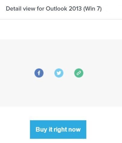
MailChimp, one of the biggest ESPs in the world, uses this layout method.
The only disadvantage of this button is that the link is connected with the text itself. Consequently, customers will need to click precisely on the copy. Otherwise, the button will not work.
Here’s the table-based button HTML code:
<table border="0" cellpadding="0" cellspacing="0" class="mcnButtonContentContainer" style="border-collapse: separate !important; border-radius: 3px; background-color: rgb(43, 170, 223);">
                    <tbody>
                        <tr>
                            <td align="center" valign="middle" class="mcnButtonContent" style="font-family: Arial; font-size: 16px; padding: 15px;">
                                <a class="mcnButton " title="Buy it right now" href="http://mailchimp.com" target="_blank" style="font-weight: bold; letter-spacing: normal; line-height: 100%; text-align: center; text-decoration: none; color: rgb(255, 255, 255);">Buy it right now</a>
                            </td>
                        </tr>
                    </tbody>
                </table>
Note: these buttons are shown properly in most email clients, yet in Outlook they are also square-shaped, not rounded.
2. Buttons written in VML
First of all, let me remind you that VML is the vector markup language, based on XML, developed for MS Office.
As long as Outlook is a one more MS Office product, all files, and graphics designed in VML, are supposed to work well in Outlook.
I created this button with Buttons.cm service that provides a ready-to-use code. I only needed to select button and font colors.
My button was supposed to look the following way in all email clients:

It really worked well for Outlook, yet Windows 10 Mail said that this button cannot be displayed:

Here’s the VML based button HTML code:
<div><!--[if mso]>
  <v:roundrect xmlns:v="urn:schemas-microsoft-com:vml" xmlns:w="urn:schemas-microsoft-com:office:word" href="http://" style="height:40px;v-text-anchor:middle;width:300px;" arcsize="10%" strokecolor="#1e3650" fill="t">
    <v:fill type="tile" src="https://i.imgur.com/0xPEf.gif" color="#556270" />
    <w:anchorlock/>
    <center style="color:#ffffff;font-family:sans-serif;font-size:13px;font-weight:bold;">hello I wonder many characters I can put here</center>
  </v:roundrect>
<![endif]--><a href="http://"
style="background-color:#556270;background-image:url(https://i.imgur.com/0xPEf.gif);border:1px solid #1e3650;border-radius:4px;color:#ffffff;display:inline-block;font-family:sans-serif;font-size:13px;font-weight:bold;line-height:40px;text-align:center;text-decoration:none;width:300px;-webkit-text-size-adjust:none;mso-hide:all;">hello I wonder many characters I can put here</a></div>
A thing to remember when using VML based buttons:
VML based button has a limited number of characters to put in. For example, if the button length is less than 200px, you are not supposed to put more than 27 characters, otherwise, the text will go to the next line.
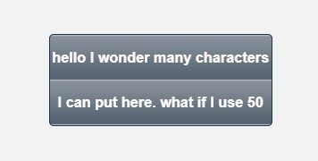
Note: some email clients may apply different fonts or replace yours with a websafe one, consequently the width of the inscription will increase. Even if you use only 27 characters, this factor may extend your button to the second line. Keep the copy short!
3. The Stripo button layout method
We build buttons by using an <a> link as the primary element, which is wrapped in a <span> element for creating borders around the button. We do not set a fixed size for these elements — our buttons stay fluid. Due to this option, our buttons may change in size in case its font size increases/decreases, too.
Internal paddings, aka whitespace, inside the button are set as the thickness of border sides.
This trick enables our button to save its text-to-whitespace ratio.
Note: as we already said, Outlook does not support CSS border-radius property. Due to this factor, no matter what shape you set for your button, it will still have right angles in Outlook. In other words, all buttons will be squared in this email client.
Here’s HTML code of the button:
<span class="es-button-border" style="">
        <a href="" class="es-button" target="_blank">Button </a>
    </span>
And here its CSS code:
a.es-button
    border-style: solid;
    border-color: #31cb4b;
    border-width: 10px 20px 10px 20px;
    display: inline-block;
    background: #31cb4b;
    border-radius: 30px;
    font-size: 18px;
    font-family: arial, 'helvetica neue', helvetica, sans-serif;
    font-weight: normal;
    font-style: normal;
    line-height: 120%;
    color: #ffffff;
    text-decoration: none !important;
    width: auto;
    text-align: center;


.es-button-border {
    border-style: solid solid solid solid;
    border-color: #2cb543 #2cb543 #2cb543 #2cb543;
    background: #2cb543;
    border-width: 0px 0px 2px 0px;
    display: inline-block;
    border-radius: 30px;
    width: auto;
As an alternative, draw an image/banner with a button over it, or just place an image of the button over a banner as an additional image and insert links to it. Done!! Apply any type of fonts, any color, shades, and any known effects.4. Button image

In other words, in case you want to create a non-standard unique button, you may either code your own one or draw it.
Note: links, which are hidden under images, never show up in emails themselves. Make sure to add alt text when placing a button image. This way, your customers will still see the very CTA button.
This is a button image example by HubSpot:
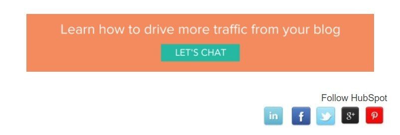
Looks like this is a banner with a green button. In fact, this is a single image with an “imaginary” button over it.
5. Animated GIF button
Animated GIF button is a great alternative to the button image.
There are two ways to do it: you may just draw a banner or any other image, including product’s snippet, place an animated GIF button over it. Or you may animate the entire banner.
Then add a link to it.
Typically, animated buttons are added to draw recipients attention to videos.
Each layout method has its pros and cons. Choose the one that fits you better. But when choosing, please remember that the longer your HTML code is, the heavier your email gets — the more chances to have your email clipped by email clients.
For example, Gmail clips messages with weight over 102kB. Our editor compresses button HTML code, and it does overload your emails.
According to numerous investigations, the shape of the CTA button does not really matter. What really matters in Neil Patel’s opinion, is:
- Color;
- Clear text;
- Whitespace around the text;
- Complementary border.
All buttons in our designed email templates already meet mentioned above requirements.
But if you need, you may insert your code into our HTML block.
I sincerely wish you all the best! May your CTA buttons be bulletproof and may your customers click them as often as you need!
